I seem to be tripping across more and more Pantone stationery these days. It’s certainly not commonplace, but it’s not exactly uncommon either. Do you ever see any Pantone products in your part of the world? Early this year I was in an upmarket booksellers store and they had a rather large selection of good quality writing instruments and stationery including a lot of Pantone products. In one of those bizarre coincidences, the very next day the postie delivered a present from my friend Kent in Korea…Ta-dah!!
I quite like the marketing ploy of numbering the products with their Pantone colour number. In this case the yellow mechanical pencil and notepad are colour 13-1746 “Maize”. For a proper colour swatch (well as accurate as your screen can display it) you can go here.
The mechanical pencil is nothing flash. In fact it surprises me Pantone haven’t gone for something of better design and quality. I’m not saying it’s a bad pencil, just to me it doesn’t fit with the price point and the market niche they appear to be aiming at. For the record it is a push top ratchet 0.5mm mechanical pencil with retractable sliding sleeve conical tip. The sticker on it states “Made in Japan”.
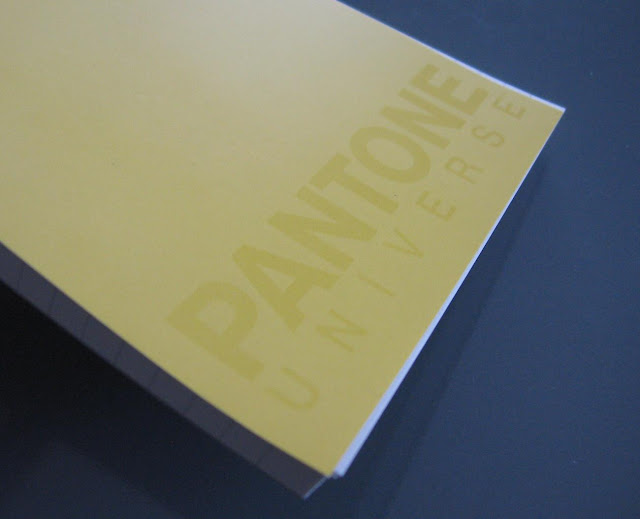
I might not be that impressed with the pencil, but I am impressed with the notepad. It is A6 sized with 100 sheets of lined paper. The Pantone Universe branding is rather subtly marked onto the cover by a difference in the gloss level. Nice.
![]()
That paper is smooth, your pencil really seems to glide across it, yet it grabs hold of graphite. Frankly, it’s the sort of paper that makes me think I should pay more attention to the quality of paper that I use. If a pencil writing experience consists of three elements – pencil, lead and paper - then I admit it’s a bit incongruous how I generally ignore the paper. My three legged-stool must be on a terrible lean! (Erasers are of course a fourth element).
![]()
I also like how the cover folds right back, and how the pages easily tear out.
Apparently "Maize" evokes feelings and thoughts like ‘radiant’, ‘inviting’ and ‘wisdom’.
![]()
Anyway, if you see some Pantone stationery, take a few minutes and check it out.
 |
| Pantone Universe mechanical pencil and notepad |
 |
| Not the greatest of colour matches between pencil and notepad |
I might not be that impressed with the pencil, but I am impressed with the notepad. It is A6 sized with 100 sheets of lined paper. The Pantone Universe branding is rather subtly marked onto the cover by a difference in the gloss level. Nice.
That paper is smooth, your pencil really seems to glide across it, yet it grabs hold of graphite. Frankly, it’s the sort of paper that makes me think I should pay more attention to the quality of paper that I use. If a pencil writing experience consists of three elements – pencil, lead and paper - then I admit it’s a bit incongruous how I generally ignore the paper. My three legged-stool must be on a terrible lean! (Erasers are of course a fourth element).

I also like how the cover folds right back, and how the pages easily tear out.
Apparently "Maize" evokes feelings and thoughts like ‘radiant’, ‘inviting’ and ‘wisdom’.

Anyway, if you see some Pantone stationery, take a few minutes and check it out.